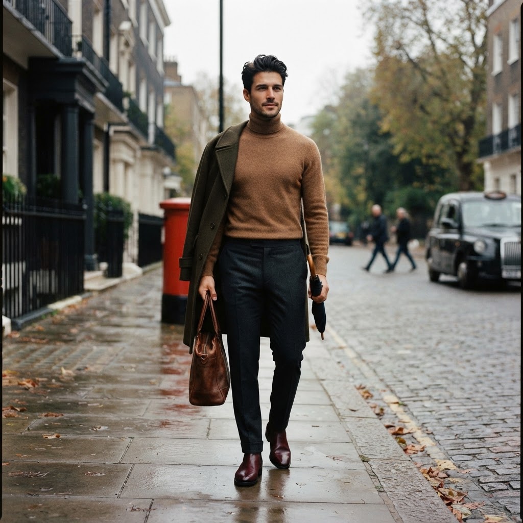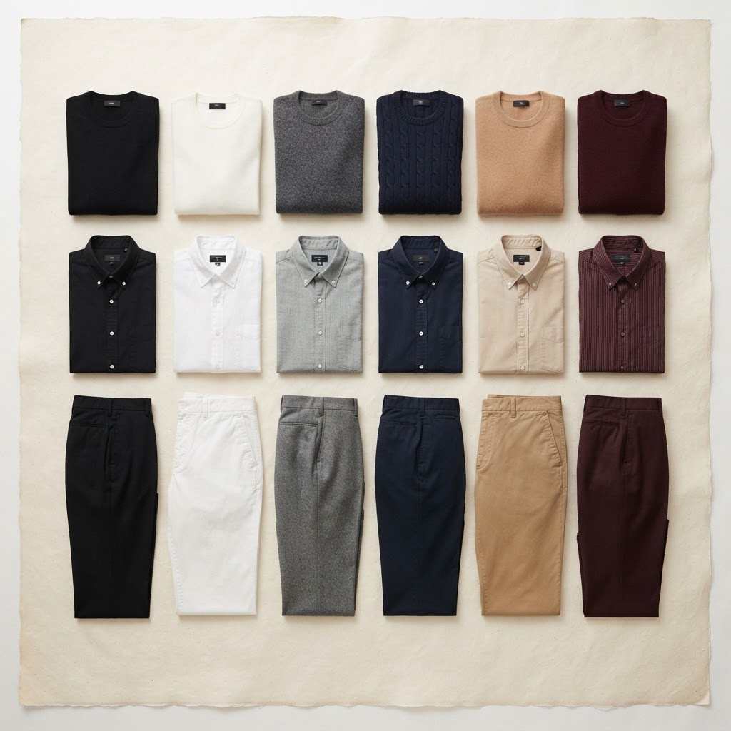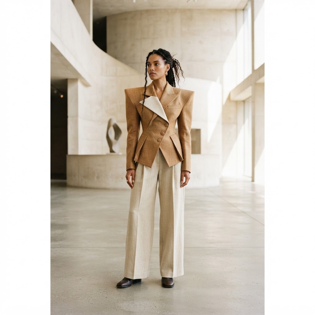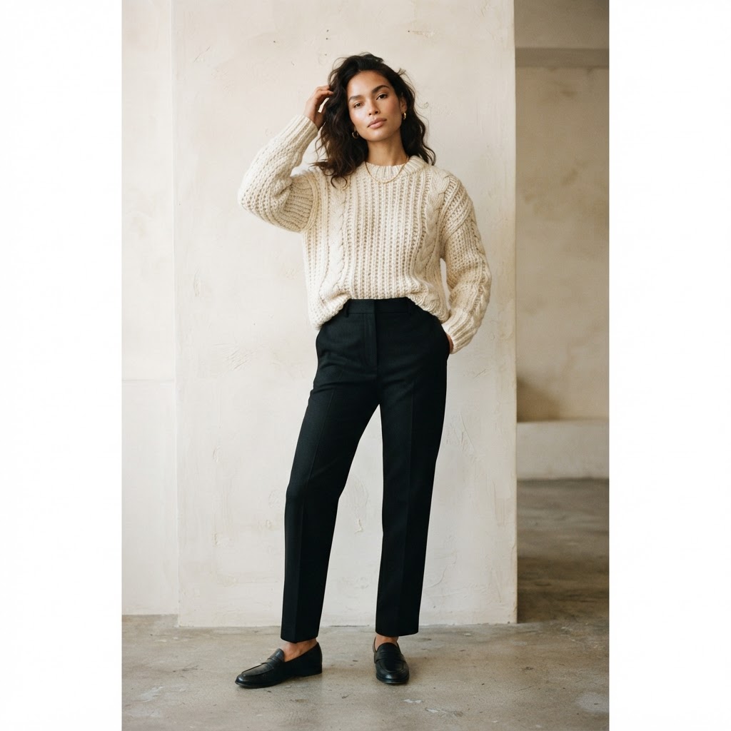
Most outfits that feel 'almost right' but somehow fall short are missing a single thing: contrast of texture. Not contrast of colour, which is easier to reach for and easier to get wrong, but the quieter contrast between how fabrics feel and how they fall. The most reliable styling principle we know is also the simplest — pair one textured piece with one solid one, and let the tension between them do the work.
The principle
The eye reads an outfit as a whole, but it gets bored by uniformity. A wool sweater worn over wool trousers in a matching weight reads flat; the garments collapse into each other. Introduce a contrast — a chunky knit against a clean, dense cotton trouser — and suddenly each piece has a boundary. The textured piece becomes the statement; the solid piece becomes the ground that lets it speak.
The same logic applies in reverse. A heavily textured trouser — corduroy, seersucker, a donegal tweed — wants a quiet top: a fine merino, a solid oxford-cloth shirt, a plain jersey. The rule is balance. One voice carries the melody; the other holds the rhythm.
Proportions matter as much as texture
Texture is half the equation; volume is the other. The shorthand the best stylists use is this: if a top is loose and textured, the bottom should be closer-fitting and solid. If a top is fine and smooth, the bottom can carry more weight — a fuller trouser, a heavier cloth. The combination of loose plus loose, or fitted plus fitted, only works when both pieces share a single texture and a single intent.
A few reliable pairings — shop the textured pieces in our men's and women's collections:
- Chunky knit sweater + tailored wool trouser. The archetypal winter combination. A heavy cable or aran knit over a clean, pressed trouser in a solid neutral.
- Textured overshirt + fine-gauge merino. The overshirt carries the surface interest; the merino underneath sits flat against the body and stays out of the way.
- Corduroy trouser + plain oxford shirt. Cord brings the texture; the shirt's smooth, dense weave provides the contrast. A consistently overlooked combination.
- Linen blazer + cotton t-shirt. Linen's slubby surface against a clean jersey is the warm-weather version of the same idea.
Colour: the supporting role
When texture is doing the heavy lifting, colour should recede. The most foolproof approach is tonal dressing — a single colour family across the whole outfit, with texture providing the separation that colour has been relieved of. Cream knit over stone trouser over tan loafer reads as one gesture; the eye moves across it without interruption, and the texture is what makes the movement legible.
If you do introduce colour contrast, keep it to two tones, and let the textured piece be the lighter or the louder of the two. A burgundy textured knit over charcoal trouser works; the same knit in solid jersey over the same trouser feels one note short.
Where it goes wrong
The most common mistake is doubling up — a tweed jacket over a knit tie over a patterned shirt. Three competing textures cancel each other out, and the eye reads the outfit as noise. The second most common is pairing a textured piece with a patterned one in the belief that 'busy' equals 'interesting'. It does not. Pattern is its own form of texture; combine the two and you lose the clarity that makes either legible.
Restraint is the whole point. One texture, one solid, one clear intention. That is the architecture of an outfit that looks considered without looking effortful.
Further reading
- Vogue — street style: power shoulders — texture as a styling device, on the street.
- Vogue Business — inside the neo knitwear boom — the renewed appetite for textured knits.